Enhancing Usability in
Molarray Medical Device
Healthcare, IoT
2022
1 PM, 1 Designer, 10+ Developer
Overview
Molarray, a biotech firm specializing in automated liquid handling systems, provides diagnostic tools used in high-precision laboratory environments. However, the complexity of operating its molecular diagnostic devices created barriers for adoption—especially among lab technicians performing daily setup and operations.
My goal was to lead the end-to-end UX transformation of the product interface, improving usability, reducing error-prone steps, and streamlining onboarding and experimental workflows.
Despite the advanced hardware, the digital interface fell short:
The onboarding process was long, redundant, and lacked intuitive guidance.
Users struggled with complex setup procedures, leading to frequent errors and experiment failures.
Mid-experiment issues often required restarting entire protocols, frustrating technicians and wasting resources.
The needs of different user types (e.g., research labs vs. diagnostics clinics) were not being met.
These usability issues directly impacted system adoption, experiment reliability, and customer satisfaction.
Discovery & Research
I conducted structured interviews with:
Internal product and engineering stakeholders
Founders and leadership
Feedbacks:
Onboarding and setup were the biggest friction points.
Experiment steps were fragmented and not aligned with how technicians naturally work.
Users lacked visibility and confidence in system status during operations.


Key Insights
👔 What Leadership Thought
Primary users
Researchers, professors, and doctors
Characteristic
Highly trained experts with strong domain knowledge
Terminology
Comfortable with complexity and technical terms
👩🔬 What Actually Happened
Primary users
Lab technicians, junior researchers, and students 🧫
Characteristic
Mixed experience levels, often new to the system and under training
Terminology
Need simple instructions and guided workflows
Hosting the Meeting to Receive Alignment:
Clearly define the user personas and design goals, then align with leadership through stakeholder communication to secure buy-in and support for the new design direction.

Primary Users: Laboratories and diagnostic centers.
Primary Clients : Laboratory technicians (over 70%), who need to set up and run experiments quickly, safely, and efficiently.
User Pain Points:
Lengthy, error-prone processes.
Complex pre-experiment preparations.
Occasional mid-experiment stoppages forcing a complete restart.


We pivoted the design to better serve actual daily users :
🧭 Introduced a step-by-step wizard for experiment setup
💬 Replaced jargon with plain language instructions
🔁 Added clear feedback and error recovery
🖼️ Used visual cues (diagrams, icons) to reinforce correct actions
Through user journey mapping and process analysis, we identified that technicians encountered the most errors during the experimental setup and operation phases. In contrast, login and sample disposal stages were relatively smooth, indicating that the core issues were concentrated in the setup and data handling stages.
I mapped the full user journey, identifying critical drop-off points.
🟥 Pain Zones: Experimental setup, protocol configuration
🟩 Stable Zones: Login, sample disposal
This analysis confirmed the need to streamline the experiment flow and improve error recovery mid-process.

Prioritize the Work
Based on user research and stakeholder feedback, we prioritized the most impactful improvements:
Redesigned the core workflow to streamline experimental setup and reduce redundant steps.
Revamped setup instructions with simplified language, visual aids, and interactive guidance.
Implemented a real-time monitoring screen to give users visibility into machine operations and reduce uncertainty.
Refined the data dashboard for clearer results, faster interpretation, and easier decision-making.
These priorities ensured the design directly addressed the pain points uncovered during discovery, improving usability and overall confidence in system operation.
Design Goal
After the interview with all the stakeholders, we determined that the main design goal for us is to improve the usability of use of the liquid handling system and increase the efficiency of the system by reducing the time it takes for users to complete tasks. Below are few matrix we used to measure our design success matrix.
Task completion time, error rate, satisfaction scores
Time to complete setup, number of repeated attempts |
Ease of onboarding across lab types and technician skill levels
Design Process
Re-Build Workflow
Reorganized the Information Architecture, simplifying the UI layout with sidebar & floating bar updates.
Transformed a 3-step machine setup into a unified, guided workflow.
Introduced step-by-step wizard with progress tracking and inline guidance.
➡ Result: Reduced setup time by ~40%, increased completion rate on first attempt.


2. Wireframes & Interaction Design
Collaborated closely with engineers to ensure feasibility and alignment with coding conventions. Key features included:
🧭 Step-by-step setup wizard with contextual tooltips
✅ Prominent Next Step button to guide progression
🔬 Smart confirmation screen to verify inputs before execution
🧠 Plain language & visuals to support users with varied technical backgrounds

3. UI Re-stucture

Design Result
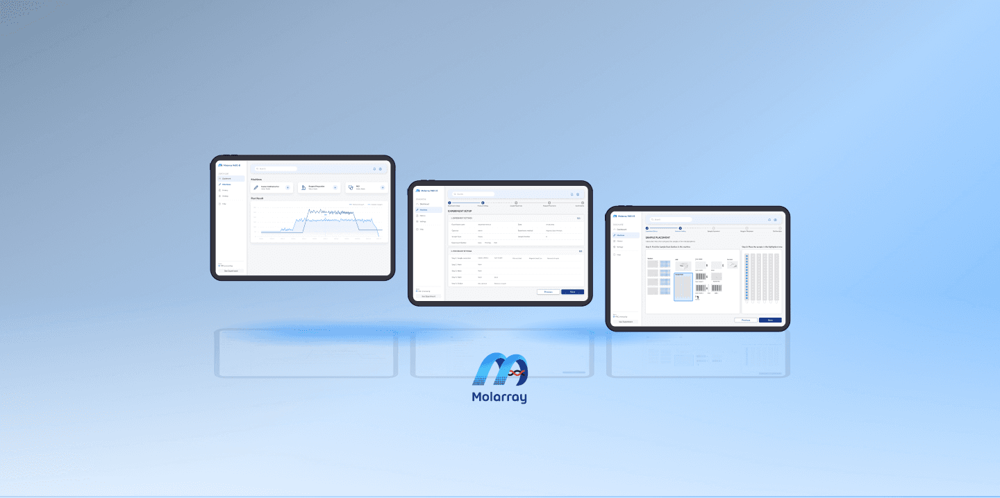
Workflow

Experiment Set-up

Protocol Setting

Sample Placement

Confirmation & Validation

Monitor Screen

Results & Data Dashboard

Prototype
Design Outcomes
✅ +45% increase in active users
✅ Significant drop in setup errors
✅ Improved technician satisfaction scores (internal post-launch survey)
Key Take-away
Short-term Impact:
Boosted adoption within the first 4 months
Streamlined experiment throughput and reduced support tickets
Long-term Opportunities:
Validate dashboard redesign through A/B testing
Expand user research to include diverse lab environments
Mature design system for scalable product line expansion
Foster cross-functional UX culture through design enablement workshops

