Redesigning Technik: A User-Centric B2B E-commerce Website
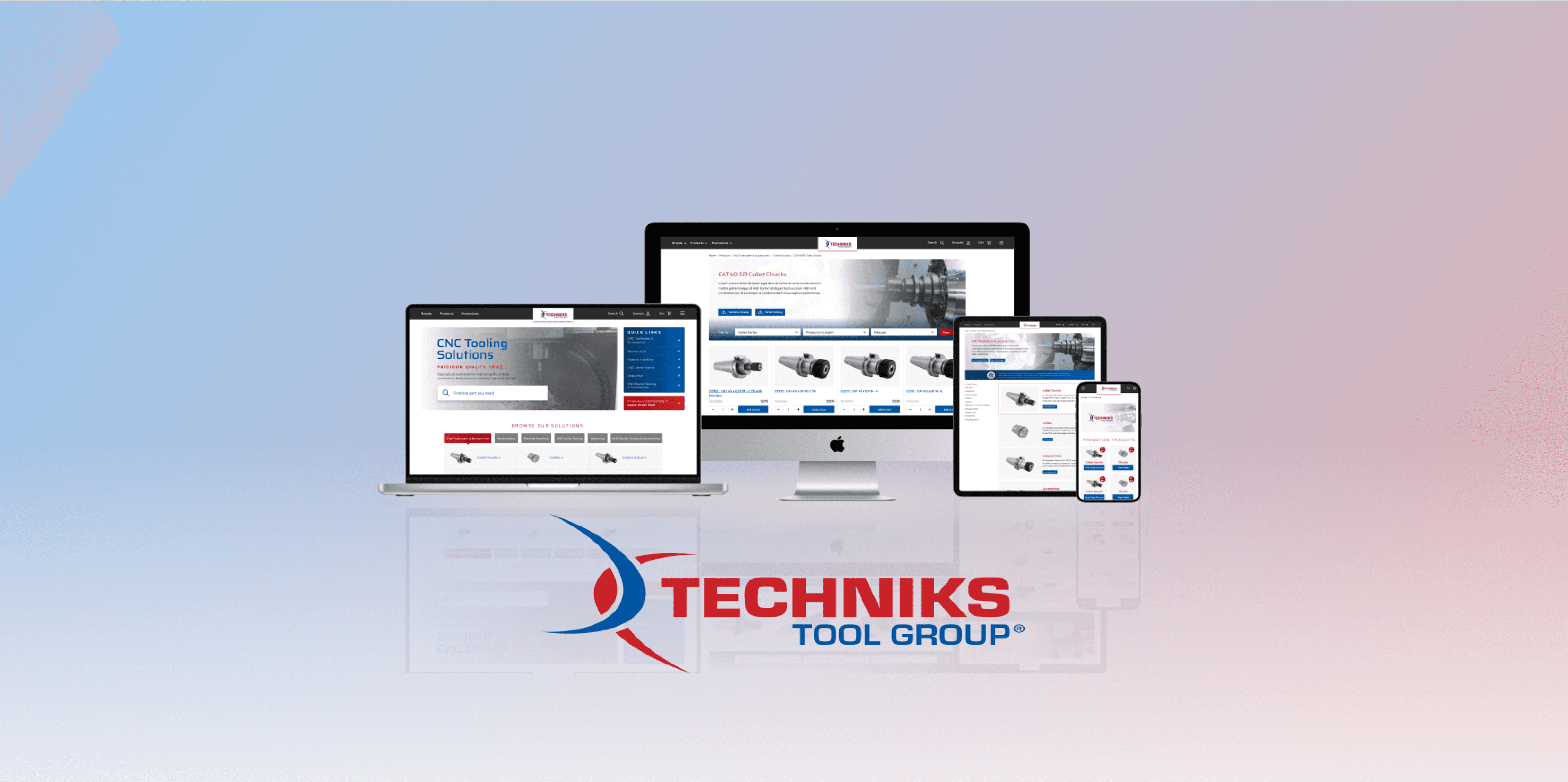
Timeline
Jun. - Sept. 2023
Topic
Portfolio Management Tool
Team
3 PM, 5+BA, 4+ Designer, 30+ Developer
Role
UX Design, UI Design, Interaction Design
🕰
Project Overview
Technik, a leading B2B e-commerce platform specializing in CNC tooling, faced significant challenges in user experience. The existing website had an outdated design and cumbersome navigation, making it difficult for users to find and purchase products efficiently. The client sought a comprehensive redesign to improve usability, streamline the user journey, and enhance overall site engagement.
🕰
Problem Statement
How to find a needle in the haystack quickly?
The Challenge:
The Challenge: Users often described the process of finding specific products on the Technik website as "finding a needle in a haystack." The extensive product catalog and inadequate search and navigation tools led to frustration, high bounce rates, and low conversion rates. The primary goal was to simplify product discovery while maintaining the depth and richness of the catalog.

🚛
Roadmap

Research & Discovery
🚛
Competitor Analysis
🚛
User Interviews
Our main Audiences

ToC User Journey Map

ToB Customer

Behavioral Analysis
Through interviews and surveys, it became evident that users were overwhelmed by the vast number of products and found the existing search and navigation tools inadequate. Users expressed a strong need for more precise search options and a clearer categorization system.
Pain points included:
• Difficulty in navigating the site.
• Lack of effective search filters.
• Overcomplicated checkout process.
🚛
Data Analysis
Design Process
1.
Redefining the User Flow:
Old Flow Analysis
The existing flow was a significant pain point. Users were required to sift through a massive list of products with minimal guidance, leading to frustration and abandonment.
Define Product --> Define Category --> Define Subcategory --> Filter the products --> Select features of the product --> Check Detail
This approach added clarity but also increased the number of steps, which could overwhelm users.
Define Product --> Define Category --> Define Feature --> Check Detail
This streamlined approach reduced cognitive load and significantly improved user satisfaction.
2.
Information Architecture Overhaul:
Objective
Rebuild the site’s architecture to make navigation intuitive and information easy to access.
• Conducted card sorting exercises with users to understand their mental models.
• Developed a new hierarchical structure that emphasized primary categories and key product features.
• Created a sitemap that balanced breadth and depth, ensuring users could find what they needed without excessive clicks.
Outcome
The new IA reduced the time users spent searching for products and decreased the bounce rate by 25%.

3.
Wireframing & Prototyping:
• Focused on layout and structure, ensuring that the new navigation and search functionalities were easily accessible.
• Conducted usability tests with these wireframes to identify potential issues early.

• Incorporated visual design elements, such as a modernized color scheme, typography, and iconography, consistent with Technik’s brand identity.
• Enhanced the user interface with interactive elements like dynamic filters, predictive search, and personalized recommendations.
• Conducted A/B testing on critical pages to optimize conversion rates.

4.
Iterative Testing & Feedback:
• Engaged actual users in testing the final prototype, gathering feedback on usability and functionality.
• Iterations were made based on this feedback, particularly in simplifying the checkout process and enhancing mobile responsiveness.
• Held regular review sessions with the client, presenting progress and gathering input.
• Ensured that the design aligned with business goals while meeting user needs.

Final Outputs
🚛
Enhanced Search Experience:
• Introduced a 'Smart Search' function that predicts user intent and offers relevant suggestions, significantly reducing search time.
• Added a ‘Narrow by Category’ feature, allowing users to quickly filter results by relevant categories.

🚛
Improved Product Detail Pages:
• Redesigned product detail pages to highlight key specifications, related products, and user reviews, aiding decision-making.
• Included a comparison feature that lets users view multiple products side by side.
Homepage --> Category --> Sub-Category --> Category Page:
Indicate main product types Subcategory Page: Display main product features

Main Page --> Group --> Sub-Group --> Group Page:
Product Listing: Display secondary product feature, price and product# Product Detail: Allow distributor to check the product detail parameter

🚛
Streamlined Checkout Process:
• Simplified the checkout process by reducing the number of steps and offering multiple payment options, leading to a 15% increase in completed transactions.

🚛
CMS System:
• Developed a custom CMS with draggable components, allowing the client to easily update product listings, content, and promotions without technical assistance.
CMS Draggable Components

CMS Pages

Client & User Feedback
"The redesigned website has boosted our business. Customers find what they need easily, increasing sales. The CMS makes updates effortless. We're excited to continue our partnership."
🕰
User Feedback
🕰
Key Takeaways
🕰
Conclusion
The Technik website redesign not only improved user experience but also demonstrated the value of strategic, user-centered design in driving business success. This project was a valuable learning experience, enhancing my skills as a UX designer and delivering significant benefits to the client.